25 APRIL SATURDAY
OUTDATED WEBSITES FULL OF ERRORS
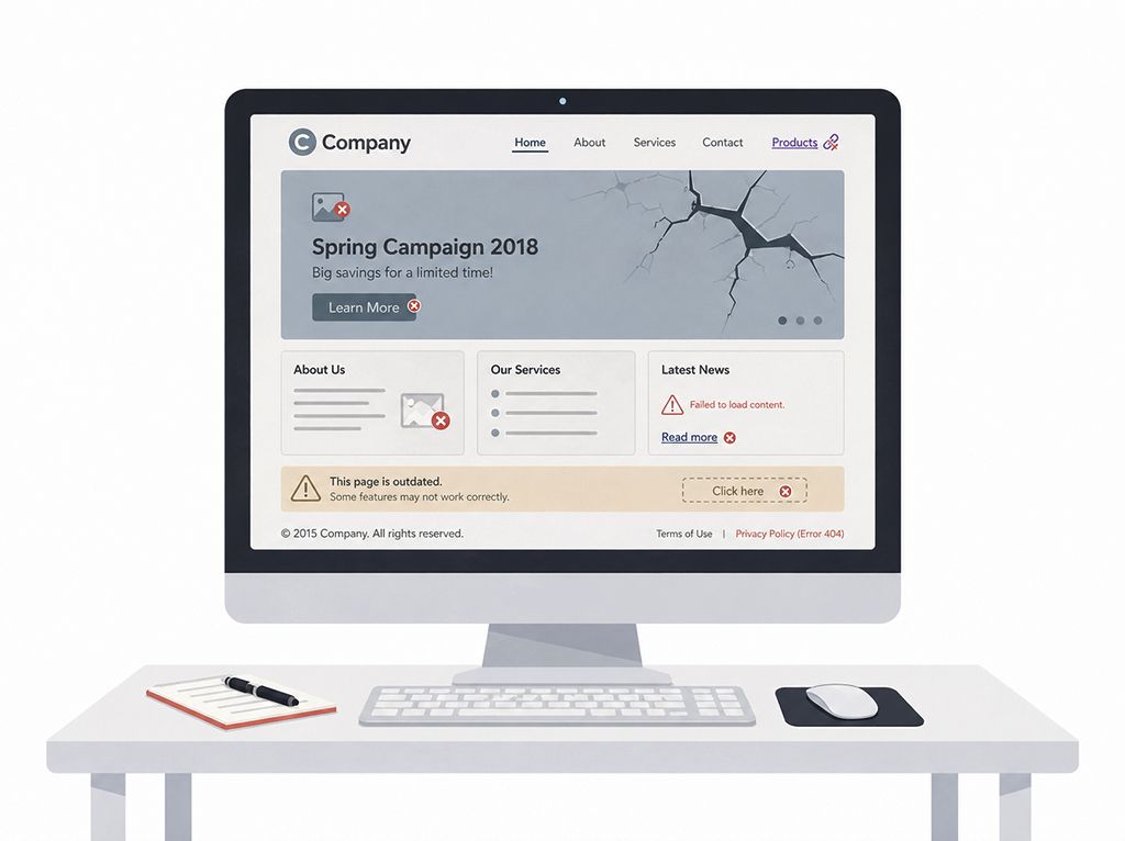
Websites that are not updated and full of errors do not only start to look outdated over time; they also slowly damage the sense of trust in the brand. Even if the website owner does not notice it, the user thinks: “The level of care shown here is probably the same level of care shown to the service being offered.”
Old campaigns, announcements that have not changed for years, buttons that do not work, pages with no content, broken images, or links that redirect incorrectly.
The fact that a website has been published does not mean the work is complete. After a website goes live, this process should continue.
Moreover, the problem is not only that the content is outdated or that there are design errors. The contact form does not work, buttons direct users to pages that are no longer valid, the mobile view breaks, images cannot be displayed…
In the eyes of your website visitors, in other words your potential customers, this disorder is not only seen as a technical problem, but also as a lack of interest in your work.
A website is not a file to be forgotten after it is published; it is a digital workspace that requires maintenance. An outdated website full of errors lowers your brand’s digital energy.
However, a website that is regularly checked, alive, and kept up to date leaves a much more trustworthy impression. Because users do not only look at what you offer, but also at how carefully you present it.
If you would like a free 10-point “Website & Brand Analysis” for your company & brand, you can contact me: wa.me/emrahavci
Don’t forget to visit my personal website: emrahavci.com
12 APRIL SUNDAY
WEAK CONTENT CAN PUT EVEN GOOD DESIGN IN A DIFFICULT POSITION
Weak content can put even a good design in a difficult position. It also blocks the process during the design phase.
No matter how aesthetic, modern, and eye-catching a website is, if it does not contain content that is truly worth reading, understanding, or benefiting from, that design is left alone. Because design often brings the user to the content, but content keeps them there. People may enter a page that looks beautiful; however, when they encounter weak texts, superficial explanations, and empty messages, they quickly lose interest and leave the website.
During the web design process, content can sometimes be expected entirely from the web designer & developer. In fact, what should happen is that this information is provided by the company and finalized with the guidance we provide. A company knows best who it is, how it positions itself, how it explains its services, and what kind of language it wants to use.
Of course, an experienced web designer makes the process much easier thanks to their own experience. They know which pages are needed in which sector, what questions users are looking for answers to, what content should be included, or what would make the website look weak if left incomplete, both through past experience and research. That is why it is important not only to be the person who implements, but also the person who guides.
The healthiest process is the one where both sides work in coordination.
I can say that in my website design process, I spend the largest part of my time on “content”. I tried to explain the reason above. Most of the time, we either receive no content information from our clients or receive very little and incomplete information.
People who want to have a website built will naturally need guidance, and I think I manage this process very well. For this reason, before creating the design draft, I determine the content in written form, then share it with them, and after their approval, I prefer to move forward step by step.
8 APRIL WEDNESDAY
WORKING AT THE SAME DESK EVERY DAY
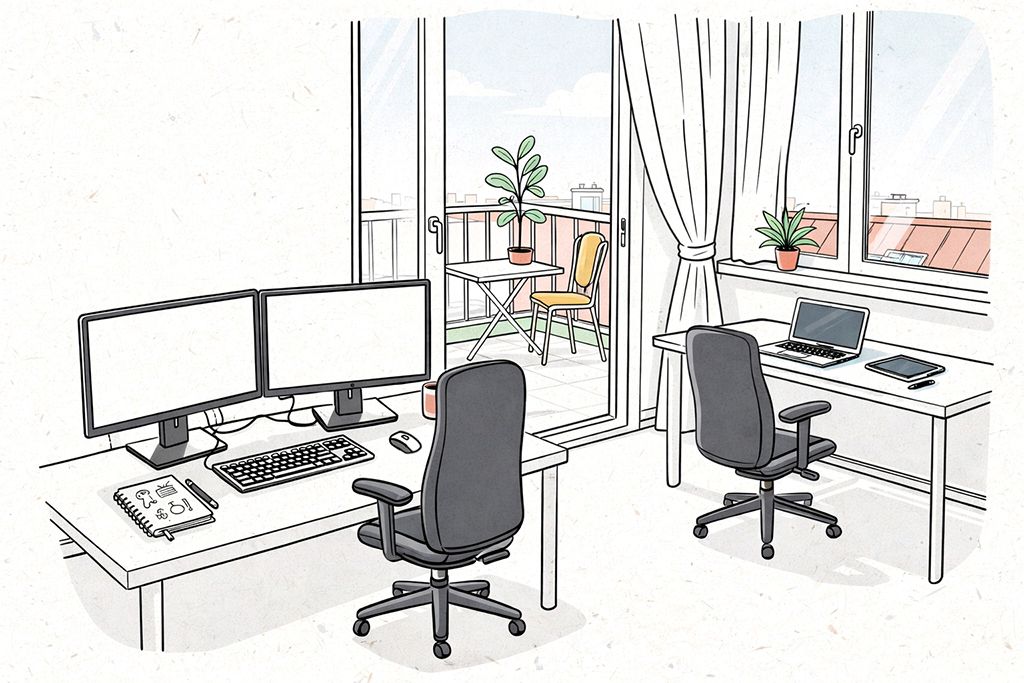
Working at the same desk every day may look like a boring routine from the outside. But if you both love the work you do and set up your workspace correctly, you sit down at your desk every morning with pleasure. I know this from my own experience.
My recommendation is to set up a main work desk where you have at least a 27-inch monitor and, if possible, an additional second monitor. Most of your working process will take place here.
Besides this, it would also be good to create 2-3 different working environments in your home or office, if possible. This will provide relief both mentally and physically.
Along with my main desk, where I have 2 monitors, I also have a corner desk by the window. I use my tablet and laptop at my corner desk. I mostly use my corner desk for things like generating ideas and making draft sketches.
In addition to this, working in completely different environments from time to time also feels very good. Sometimes working in a café, on a balcony, in nature, or by the sea helps you step outside your daily routine.
For someone who can work with a laptop, productivity is not limited to sitting at a fixed desk. Not every place you sit has to fully be a “work desk”. Also, you do not have to complete the most critical parts of the project you are working on there; you can make these kinds of changes simply to refresh your mind, find new ideas, and increase your morale and motivation.
For this reason, your main work desk should include everything you need; your other working environments can be more flexible and inspiring corners that come into play depending on your needs.
2 APRIL THURSDAY
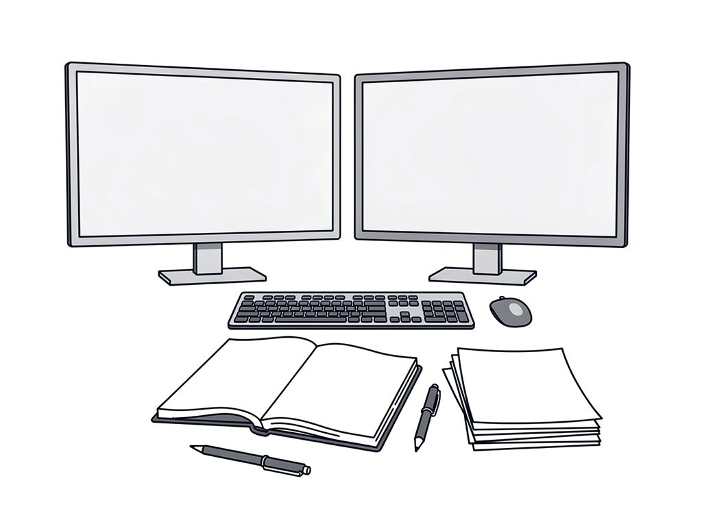
TAKING NOTES ON PAPER
Taking notes on paper continues to live on as a strong habit, despite all the developments in the digital age.
Because sometimes, people do not want to quickly gather information in one place; they want to slow down their thoughts and hear their mind more clearly. Digital screens and apps offer us great conveniences such as speed, organization, and access; however, when working with paper and pen, you can establish a more direct and stronger connection with your thoughts.
At the computer, I usually work with either two monitors or a laptop and a tablet. In other words, there are always two screens in front of me. One of the biggest advantages of having a sheet of paper in front of me is that it reduces my distraction, and most of the time, even eliminates it completely.
Let me explain how: When taking notes digitally on a computer, there are always multiple apps, tabs, notifications, and similar distracting elements in front of us.
Even when I use two large screens, 27-inch and 34-inch, and set aside part of these screens for my digital notebook, I still cannot prevent this distraction.
Of course, the notes I take are not perfect as if I were doing a design job. I use the notebook and papers in front of me more like a sketchbook. I quickly write down my ideas, scribble things, and transfer whatever comes to my mind as it is. After the note-taking process is finished, I reorganize them in the digital environment. Then I print them out again from my printer, and the notes stand in front of me in their cleanest and most accurate form.
And again, I can exchange ideas on those notes with colored pens and make new additions.
There are also places or times when I cannot use paper and pen. In such situations, I take digital notes with an iPad and pencil, as if writing on paper. Frankly, this method does not give me exactly the feeling that real paper gives. But especially when I need to make draft sketches rather than write, it becomes one of the methods I use often. It is quite useful when I feel the need to constantly erase, reorganize, and intervene.